
Brand Concept
The Courtyard hotel nestled in the Gaslamp quarter of San Diego downtown originally opened its doors as the San Diego Trust and Savings Bank in 1928. Much of the historical building designed by William Templeton Johnson has been kept the same; from the underground vault converted into a conference room, to the gentle divots in the green marble flooring worn away by hundreds of feet patiently waiting in line for their turn at the tellers.
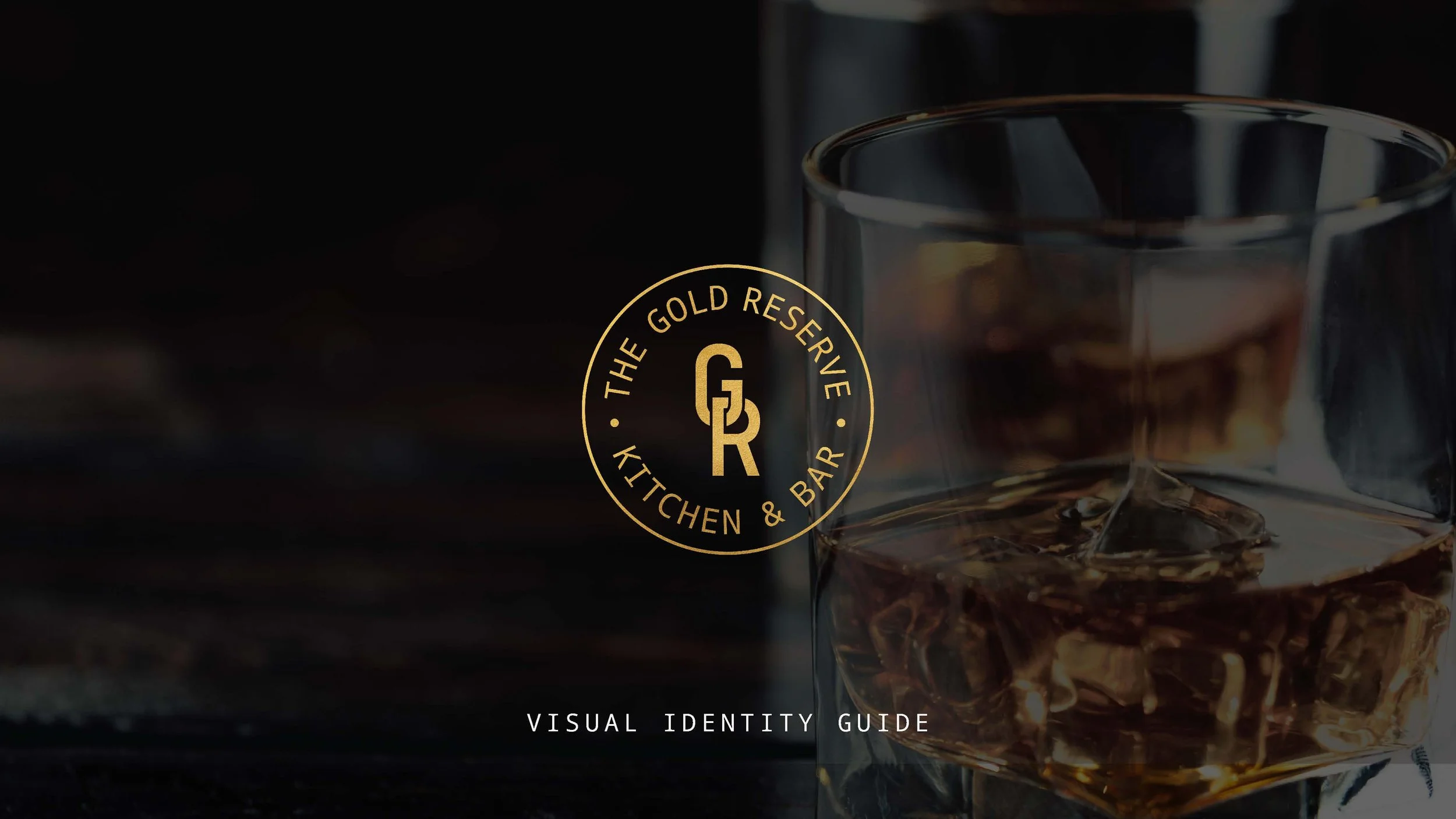
During the discovery phase of this project it became clear that the new brand identity of the lobby food and beverage offering had to honor the building’s roots. The Gold Reserve Kitchen & Bar became a clear favorite amongst the naming directions as it held clear ties to the building’s origins and set a high standard for service.

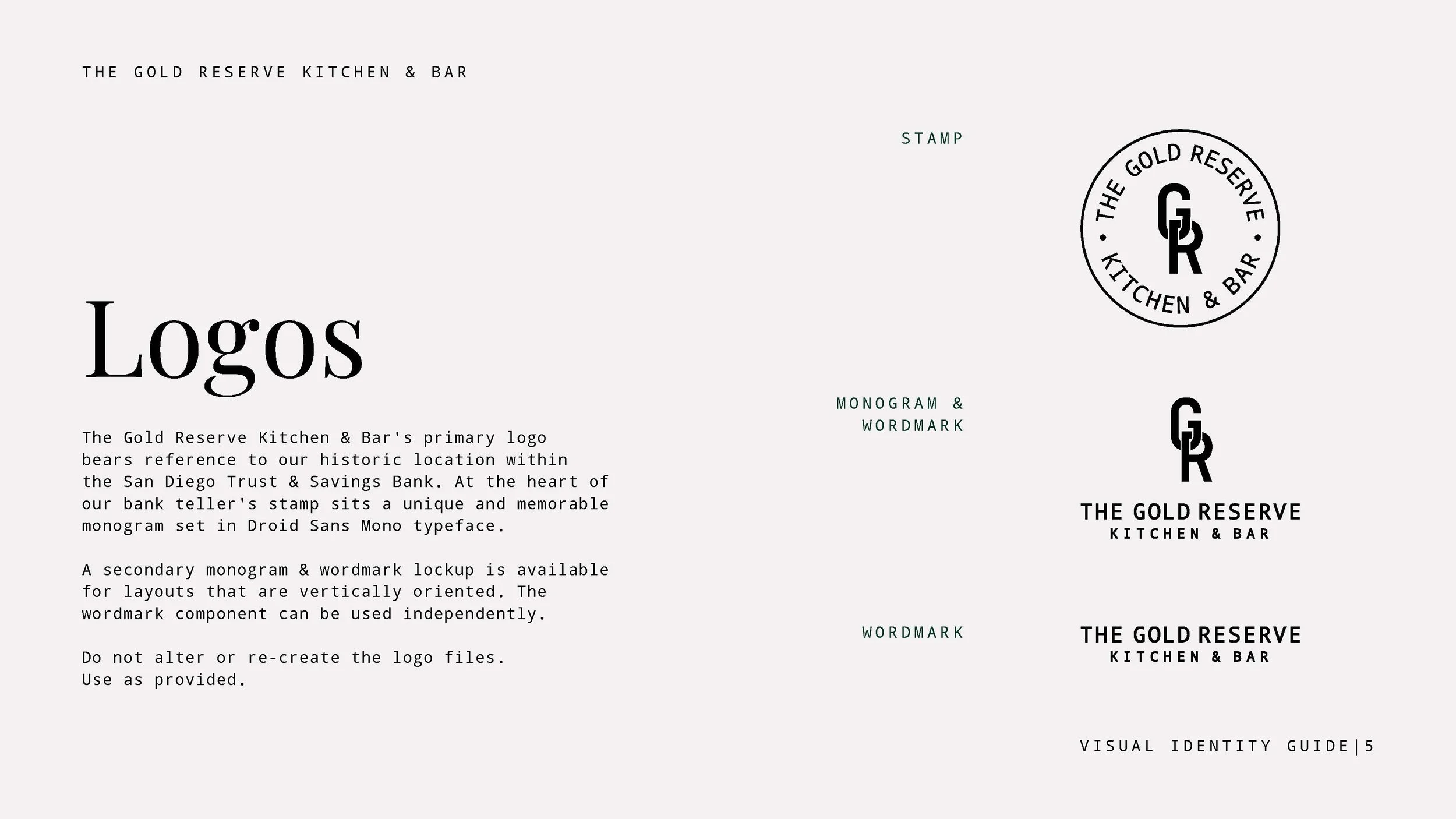
We took inspiration from the building’s story and crafted a logo that references the stamps used by bank tellers to sign off on important documents. In place of a teller ID is a monogram for The Gold Reserve that feels both unique and modern.

A secondary lockup was created for vertical use. A brand color palette featuring jewel tones was selected to pair with the lobby interior’s gold tones.


Click through to see the full brand guidelines: